Task Management System
PRODUCT RESEARCH - DESIGN - STYLE GUIDE
Due to Classification, some information may be redacted.
Our customer has a suite of applications where users perform their tasks and wants an application that is able to manage and update all their tasking in one place.
The current system is outdated, unreliable, tedious, and creates discrepancies between siloed teams and apps. There were some obvious areas to improve as well as other features that several users brought up: automation features, filters and sorting, integration with their current suite of applications, and the ability to assign directly in-app.
THE TEAM
2 UX designers, 1 PM, 1 software manager, 2 back-end, 1 front-end
MY ROLE
Sole designer while conducting discovery research, creating the style guide, and most of the current UI
TIMELINE
Oct 2021 - Current
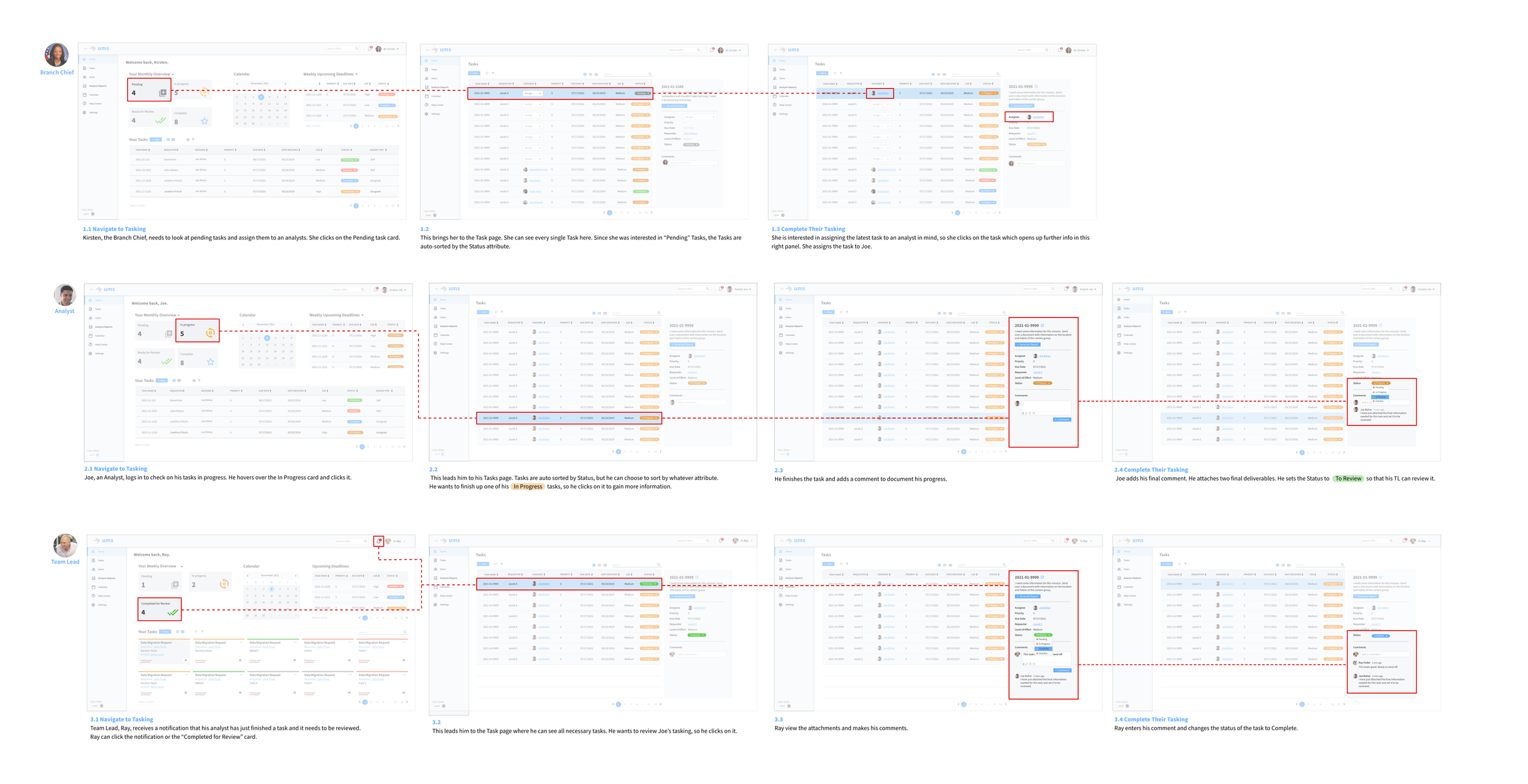
HOW MIGHT WE
provide an automatic and intuitive way for our Chiefs to assign tasks, Analysts to complete tasks, and Leads to review tasks, all within the same suite of applications?
RESEARCH
Workflows & Affinity Diagram
After interviewing several users in each user group, I took insights from each interview and organized them on colored '‘sticky notes” that each have a theme themselves. I then clustered notes that had insights into similar features. Finally, I named each cluster to identify a theme.
Impact x Effort Map
To prioritize features, I categorized Potential Feature Requirements into a map that shows the impact the feature would make on the application and the effort it takes to develop it. This required feedback from users and conversations with developers.
The first map illustrates broad features, while the second map illustrates the features in more detail.
Users
Our personas represent each user group we interviewed. Each user has a different purpose and goal, which are reflected in the user stories.

User Journeys
Since we have multiple users, and each one has a different role, I thought it would be beneficial to create a journey map for each Persona to illustrate an example of their potential actions, feelings, struggles, and opportunities as they move through the application.
Flowcharts
I created internal diagrams to clearly understand how the user is guided through each step of their process and how those tie into each other. The client liked the flowchart so much that they wanted one to explain to leadership the general gist of the TMS and its capabilities. So I created a flowchart of each user in a more concise and easily-digestible manner.
DESIGN
🔦 Style Guides for light and dark mode
Another deliverable from this project was to create comprehensive style guides for both light and dark mode so that developers and designers can continue to create the application with consistency and ease.

Dark Mode Style Guide

Light Mode Style Guide
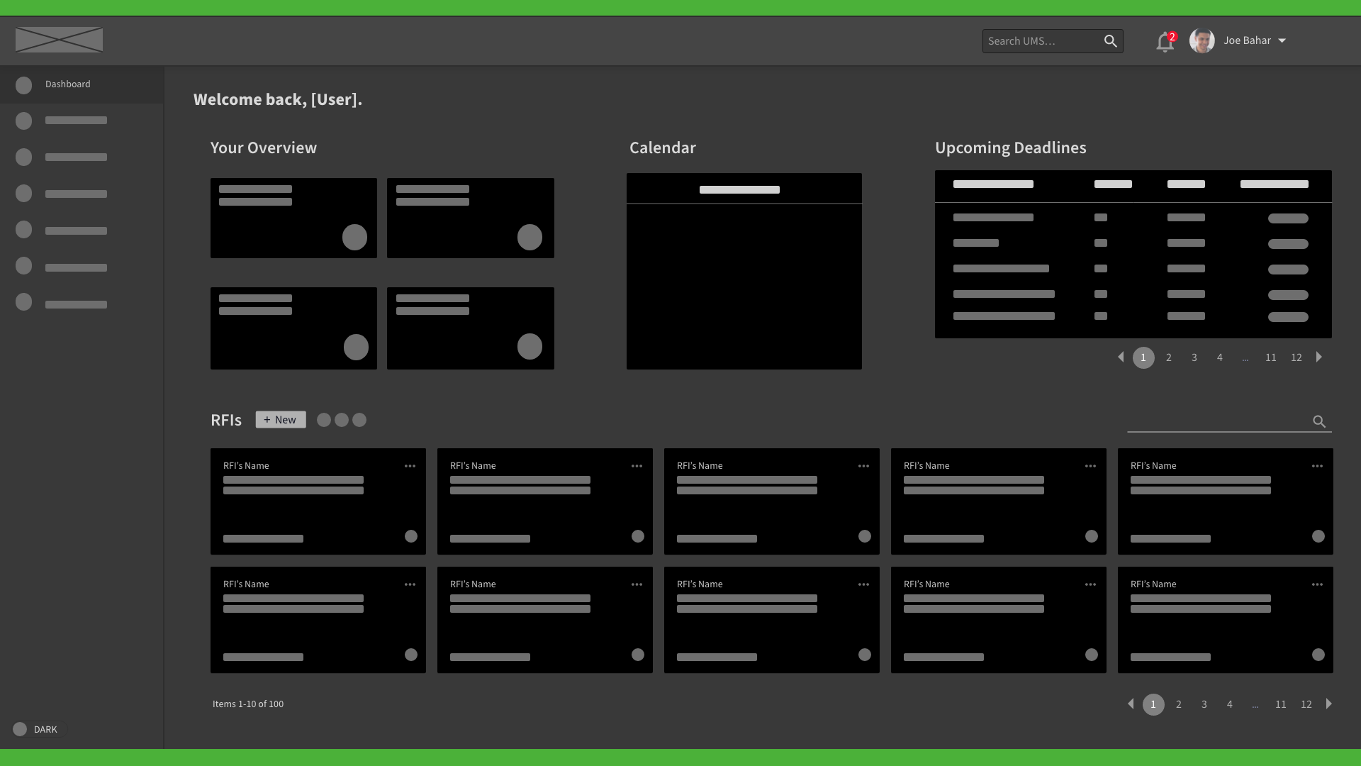
Initial lo-fi wireframes of potential ideas for the Dashboard display - the first page a user would land on.
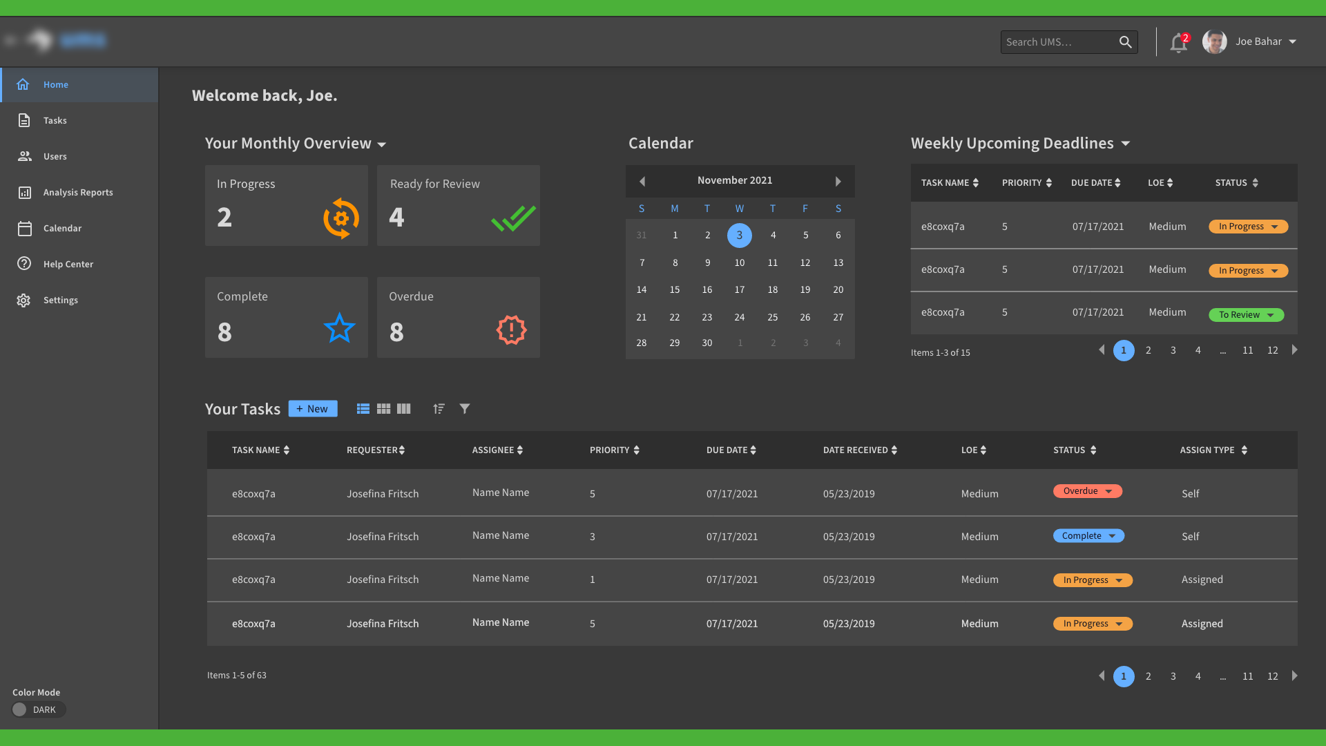
Dashboard display with an Overview of their tasks’ statuses, a Calendar to view upcoming due-dates, and a minimized Tasks view.
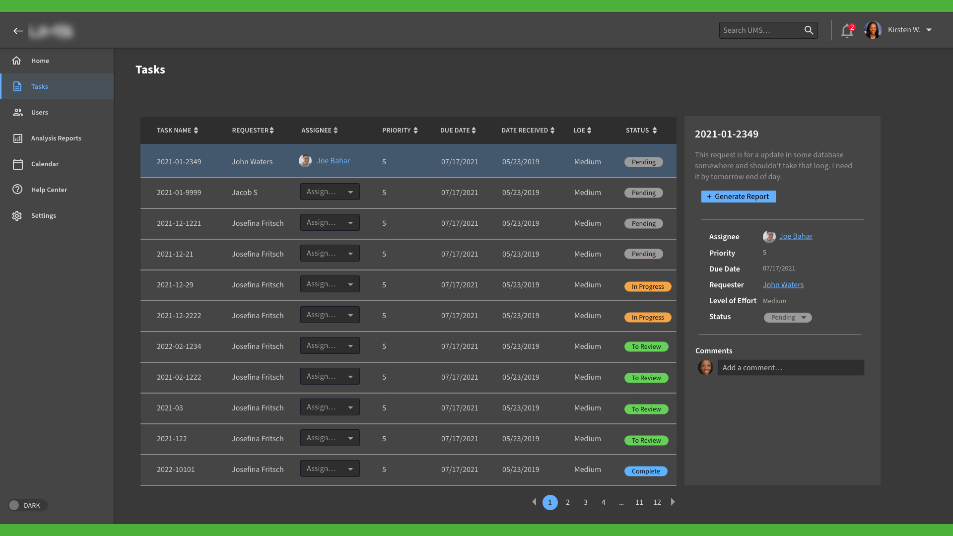
Display of all Tasking and their statuses
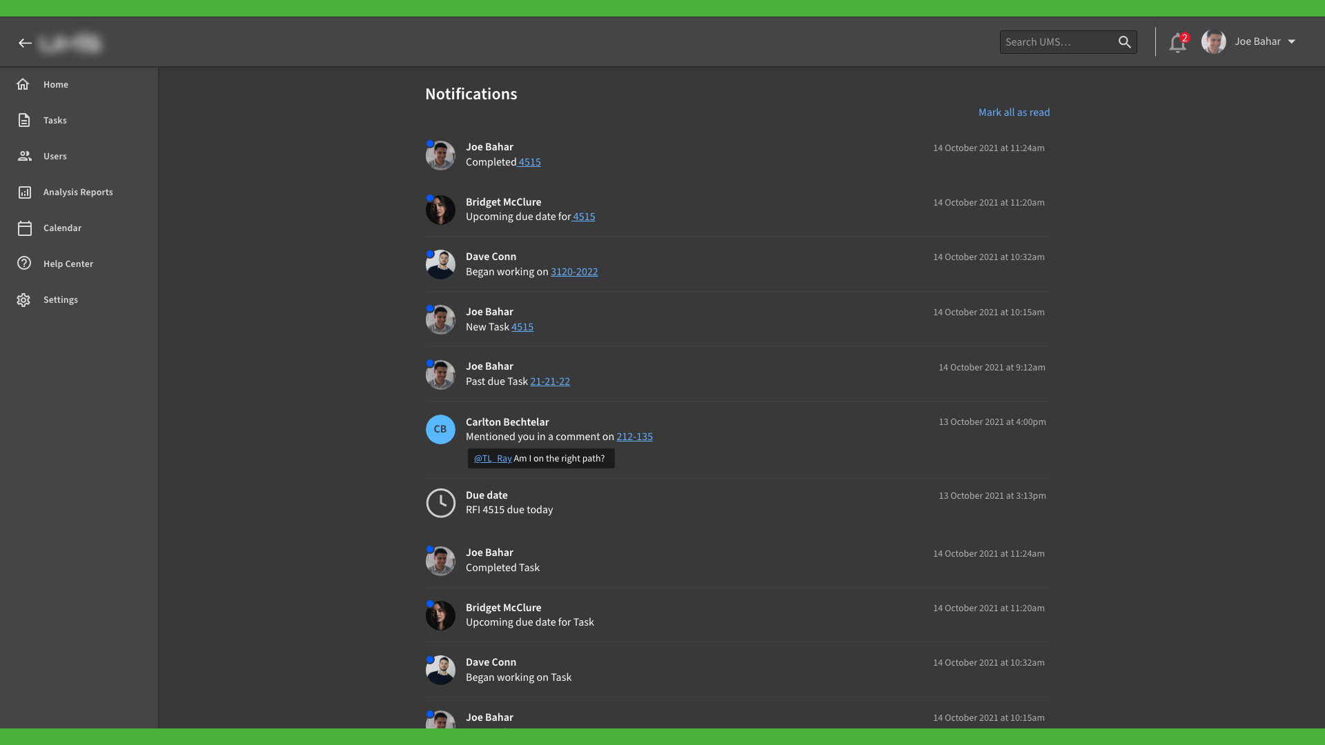
Iteration of the Notifications page