
Mercy Education Project
UX RESEARCH - WEB UI DESIGN - ITERATIVE DESIGN
Mercy Education Project (MEP) is a nonprofit in Southwest Detroit that is focused on empowering and educating disadvantaged women and girls so they can lift themselves out of poverty. From understanding our client’s needs to creating a high fidelity prototype, I was able to help lead my team and successfully launch MEP’s new website in the Summer of 2020.
THE TEAM
3 UX Research & Designers
MY ROLE
Creating a research plan and documentation, on-site interviews, UI design, usability testing and analysis, iterative design
TIMELINE
October 2019 - March 2020

⛰ The Challenge
We were tasked with modernizing the MEP website. Their current website was text heavy and outdated (which is partly due to the fact that it is difficult and costly to have 3rd party developers make edits).
We modernized the new website to make it more visually appealing and accessible by creating it on SquareSpace, which will allow MEP to make future changes themselves.
🎯 Our Goals
Provide MEP with a redesigned site that is visually appealing, easy to use, and helpful for students, donors, volunteers, and staff.
Increase MEP’s digital presence through site modernization
Provide insight and design recommendations based on the needs of volunteers, donors, staff, and students.
RESEARCH PLAN
📝 Heuristic Evaluation
We conducted an evaluation of the following heuristics: Visibility of System Status, Match between System and World, Aesthetic & Minimalist Design, Consistency & Standards, Recognition Rather than Recall. We rated the interface based on these principles and recorded our observations.
🏙 Competitive Analysis
To understand how other non-profit sites function, we analyzed the digital experience of competitors. We researched Direct Competitors, Indirect Competitors, and Innovator Competitors.
💬 On-Site User Interviews
My favorite part of this project were the on-site interviews with users. We created three interview scripts (donors, volunteers and one for the students). We used Voice Memos and the Otter application to record and transcribe each conversation.
👩💻 Usability Testing
Once we complete the first iteration of our prototype, we conducted a series of virtual usability tests to validate our designs. We created four different usability tests with tasks that correspond to each group: student, staff, volunteers and donors.
ANALYSIS
Affinity Diagrams
We took key words, phrases, and insights from our user interviews and grouped them into overarching themes. We used the visualization of each of these themes in the development of our personas, user journeys, and UX requirements.
Personas
In developing our user personas, we wanted to reflect our user groups: staff, volunteers, donors, and students.

“Donors and volunteers are crucial to MEP and our goals”

“I love MEP’s mission and how big of an impact they have on their students”

“MEP caters their education to each student. I have learned so much here”

“I want to give other girls the opportunities that I had growing up”
User Journey Maps
We created user journey maps in order to visualize each persona’s interaction with the website over time. These maps allowed our team to develop a more user-centric approach to our designs and understand where exactly user pain-points were coming in.
Staff
Student
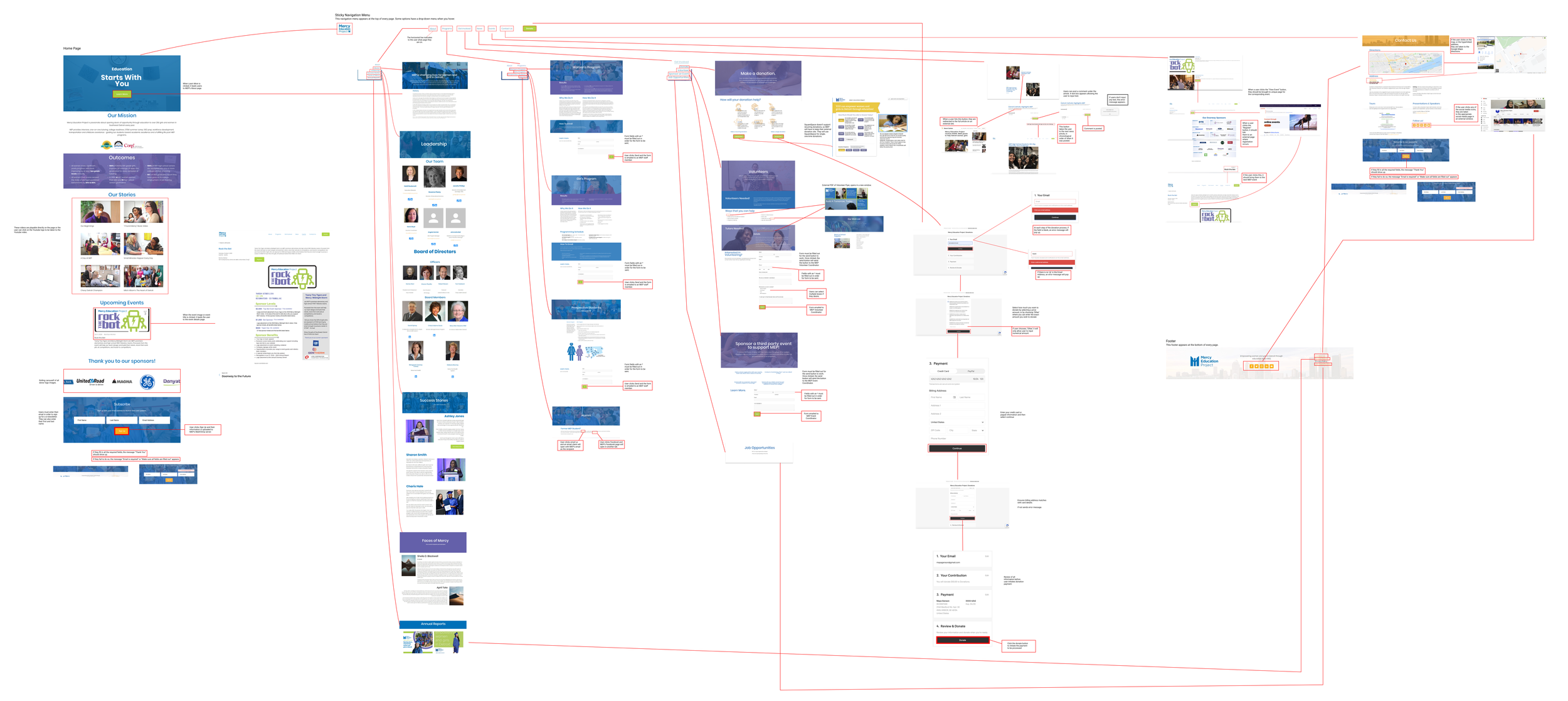
User Flows
We developed user flows to gain a better understanding of our users and their behavior when it comes to using the website. The user flows helped us create the website by focusing on specific tasks users would perform. We were able to see the overall picture of the website more clearly. As we delved deeper into the design process, the user flows made it easier to remember how and why some decisions were made
We then developed requirements based on our client’s requests, our user research, our competitive analysis, and heuristic evaluation. They are presented below in order of most to least important.
DESIGN REQUIREMENTS
🛠 Internal Website Updating
66% of MEP staff requested that they want to be able to edit the content of the site with pictures, news, events, and general information.
💳 Donate Button
MEP relies on donations, so donating needs to be a main aspects of the site. Users should feel confident in where their money is going.
📆 Calendar of Events
45% of interviewees said that events and fundraisers were hard to find. Having a calendar of events makes it easier to connect with people, especially donors.
🎞 Pictures and Videos
Personalized media will “heighten trust and compassion,” as said by one of the staff members, because pictures show MEP’s impact.
📱 Mobile Friendly
100% of the students indicated that they primarily use their phones to access the Internet. Our users also said that the mobile view is currently hard to read because the text is small.
👩🎓 Prospective Student Page
This page would immediately reduce the number of phone calls and allow for easy referral to the page.
🌎 Language Translations
The majority of students speak Arabic and Spanish. This would allow for transparency and accessibility of all students.
💻 Compatible with MEP Softwares
The site needs to work with Raiser’s Edge so they can maintain donor info. It also needs to work with MailChimp so they can keep email subscribers and campaigns.
✏️ Sketch
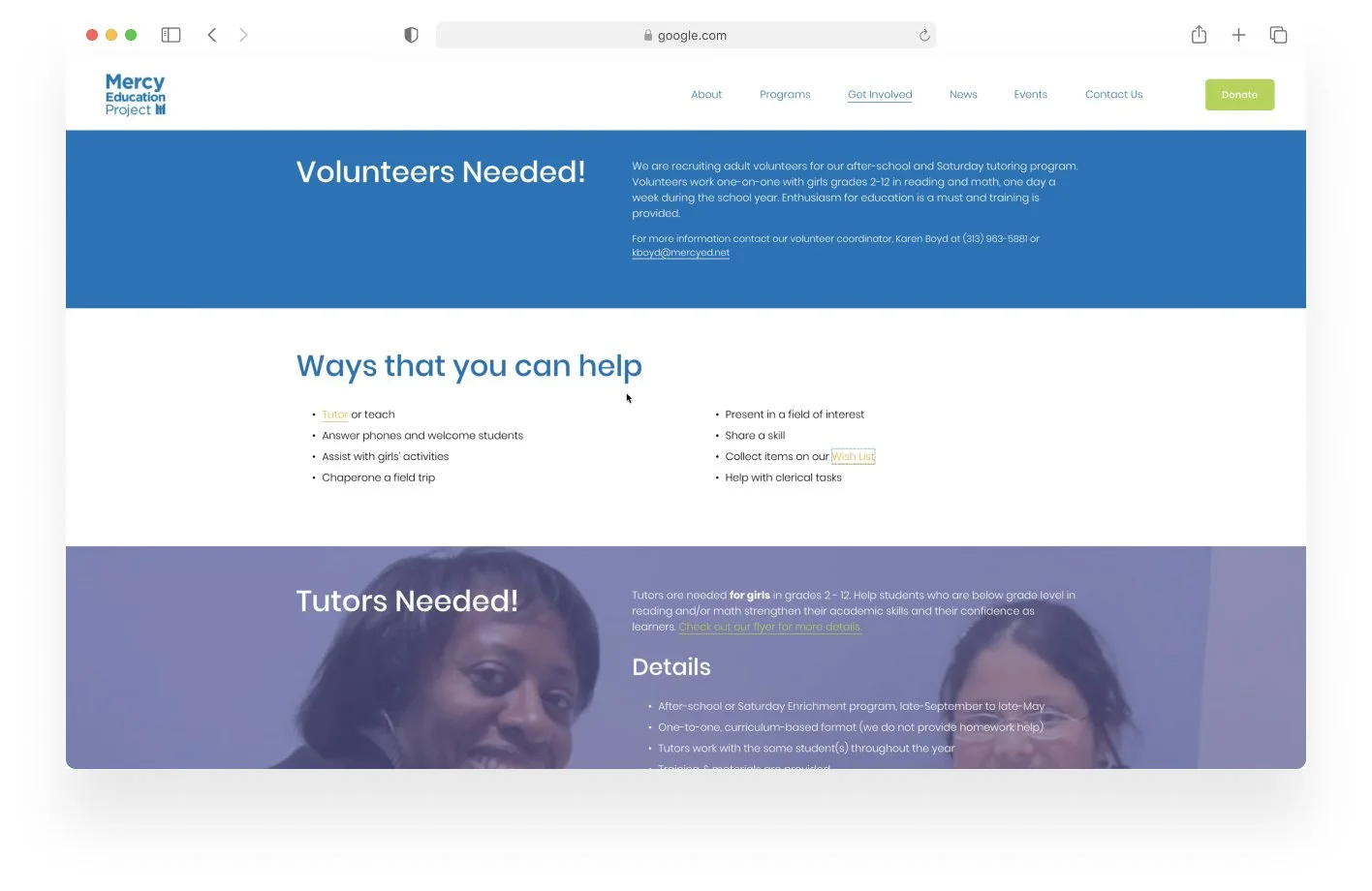
After analyzing the various sketches from our team, we were able to discover common themes to create a single home page sketch. This sketch was then translated into a wireframe. Compared to MEP’s current site, photos and videos are used to convey information instead of the heavy use of text. This was based off our interviews with multiple people indicating that the website was too text heavy.
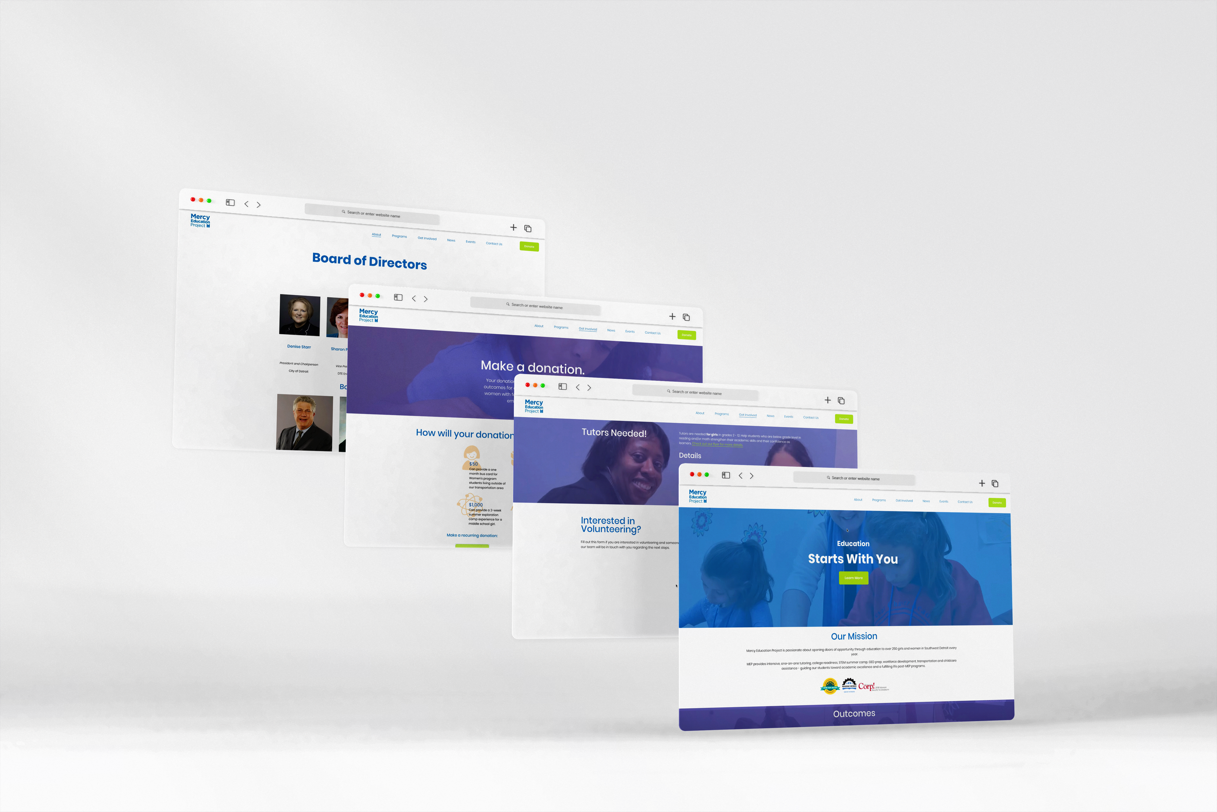
🛠 Prototype
We translated our sketches into a working prototype on Squarespace. These first designs would be iterated on once we got user feedback in our validation study.
Link to Interaction Flow shown below.
VALIDATION STUDY
Research Questions
1) How easy is it for users to find the information they are seeking?
2) How satisfied are users with the layout and navigation of the website?
Study Approach
Remote usability testing using Zoom screen sharing and audio recording features.
We will have four user groups to test: students, volunteers, donors, and staff members. Each group uses the site for a different purpose, so our tasks will revolve around ensuring each group are easily able to find what they need on the new site.
Data Analysis and Results
To analyze the data we obtain from the remote moderated usability tests, we identified overall trends and commonalities that each testing participant voiced during the usability testing sessions and the post-test questionnaire.
You can find the specific data findings in our final report here.
Insights
Based on usability test recordings and the post-test questionnaire we asked all participants to fill out, we found that the participants found the website to be easy to use and fairly intuitive, as well as what MEP is and how they help their community.
Using the aforementioned methods of data collection and analysis, we derived the following findings from the study:
2. 💳 No recurring donation option
3. 🤷🏽♀️ No indication for more info on Home Page
4. 📐 Standardization of About Tab
5. 🗓 Registration for event
6.
Unnoticeable social media icons
ADJUSTMENTS TO THE FINAL DESIGN
Using insights derived from the usability tests, we generated the following recommendations to be made to the website:
MEP will still use SquareSpace for single donations, but we will add a link for Gift Smart for those wishing to set up recurring donations.
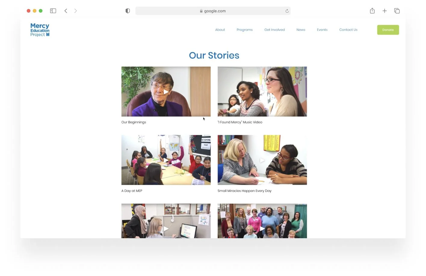
We will merge Faces of Mercy and Success Stories into a single Faces of Mercy page that will highlight: current students, alumni, donors, volunteers and staff.
For the volunteers page, it was decided that it was too confusing to have both a contact form and an official application. After discussing with MEP, it was decided that the volunteer page would only have the contact form.
Linking the event registration button to MEP's Eventbrite page to allow for users to register and rsvp to upcoming events.
Too much empty white space; something we initially thought was a limitation of SquareSpace. After more research, we were able to find a way to decrease the white space.
The social media icon links will also be added to the contact us page for users who don't know that they are also in the footer.
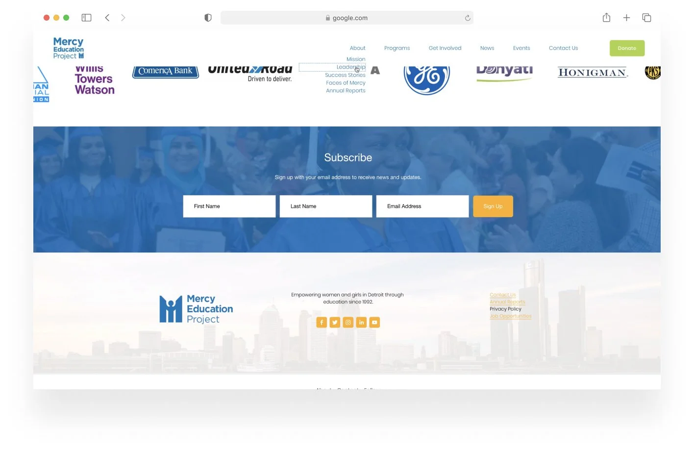
We will incorporate more color into the page with the use of banners and images, as well as using more of MEP's color palette instead of just the blue to have a more playful feeling to the website.
VIDEO OF FINAL DESIGN

REFLECTION
Looking back, I’m grateful for the opportunity to work with Mercy Education Project. Their mission of uplifting women in the Detroit area allowed me to want to do my best work for this non-profit.
Now that in-person user interviews can be difficult, I’m also appreciative for the opportunity that I had to interact with users on-site. Redesigning this website for our various types of users by gathering insights from interviews, to user testing, and iterating on a final design was a great learning experience.
I learned how to conduct the entire formal design process and guide ourselves along as a team, with expert instruction from professors whenever we needed. I love seeing metrics that support my design decisions, and this project really allowed for that because we conducted formal UX research twice throughout the process. I was also able to get first hand experience in learning how to properly recruit, schedule, host, and facilitate a user testing session.
NEXT STEPS
Additional validation testing on a few parts of the updated site is needed.
🌎 Multilingual Options: We were unable to accomplish the requirement of making the website multilingual in Arabic and Spanish. Current pages will have to be duplicated and changed into the desired language. SquareSpace does offer support for this functionality, so it must be done manually.
🎞 Leadership Photos: Upload missing head shots for the appropriate people on the Leadership page.
✒️ Updating Pages: The staff will have to consistently update the Faces of Mercy page at least monthly with testimonials from the MEP community. They will also have to ensure the News & Events page so that they are up to date.