Up To Speed
COMPETITOR RESEARCH - PROTOTYPING - STYLE GUIDE
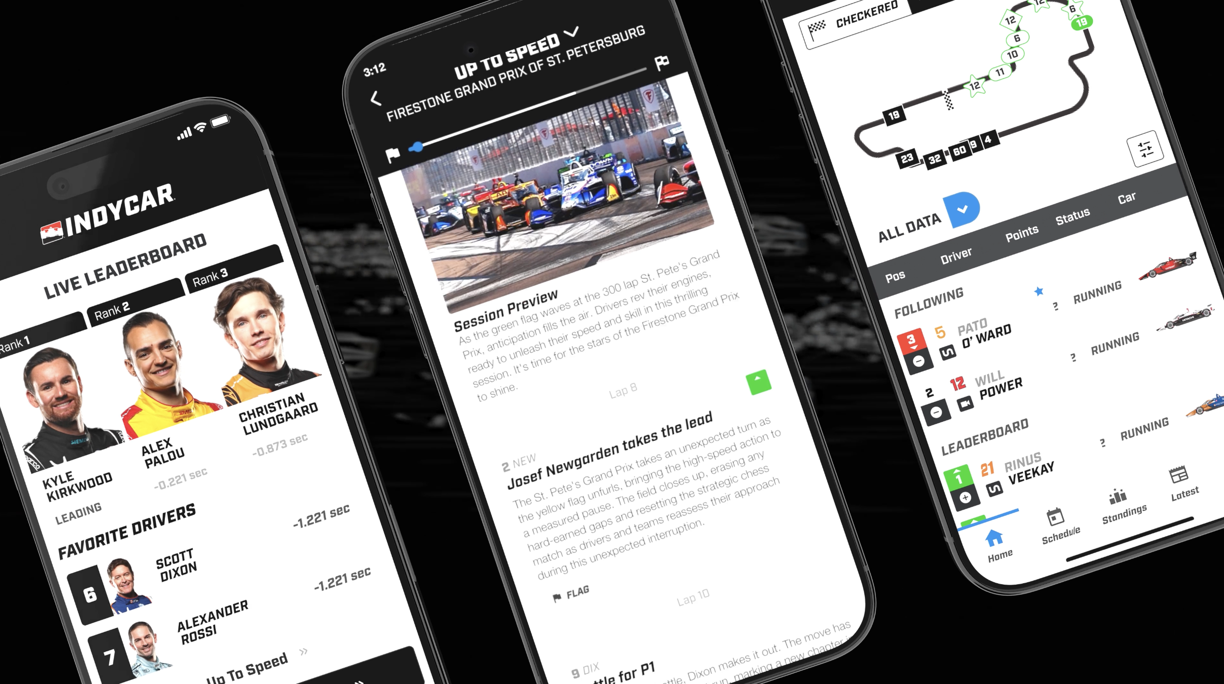
Up To Speed is a generative AI feature built into the INDYCAR mobile app for fans who miss any part of the live race. The existing Live Race Center experience had no way to help fans get oriented. There was live data, but no narrative layer to make it meaningful or get fans up to sped. The goal for INDYCAR and the Up To Speed feature was to build something that felt native to the sport and genuinely useful, not just a novelty AI feature.
I was brought in as the UX designer to figure out what a catch-up experience should actually feel like, and to design it from the ground up. That meant defining the content architecture, designing a scrollable event card system that could handle 41+ distinct race moment types, and working closely with the NTT DATA Event Engine team to make sure the AI-generated output was accurate, useful, and on-brand for INDYCAR.
THE TEAM
2 UX designers, 1 PM, back-end devs, front-end devs, QAs
MY ROLE
Full time product design and assisted with workshop facilitation and prompt engineering
TIMELINE
2025 - 2026 season
PROCESS
From data stream to fan story
The project moved through four overlapping phases: research, architecture, design, and iteration with live SME feedback. I operated as both researcher and designer throughout, owning the UX end-to-end while staying embedded with the engineering and product teams.
Phase 01
Discovery & Competitive Research
Analyzed how F1, NASCAR, NBA, and NFL apps handle fan engagement during live events. Interviewed stakeholders and mapped the INDYCAR app's existing information architecture to find the lowest-friction entry point for a new feature.
Phase 02
Content Architecture
Worked closely with the NTT DATA Event Engine team to define and categorize 41+ event types, from lead changes and pit strategy to P2P trains and qualifying bumps. Developed a priority scoring system (0 to 100) to determine which events surface to fans and in what order.
Phase 03
UX Design & Iteration
Designed the MVP: a scrubber-led timeline with scrollable event cards, each containing a driver ID, position indicator, AI-generated headline and description, and a storyline badge. Presented to internal teams, then iterated based on INDYCAR SME feedback across all 41 storyline types.
KEY DESIGN DECISIONS
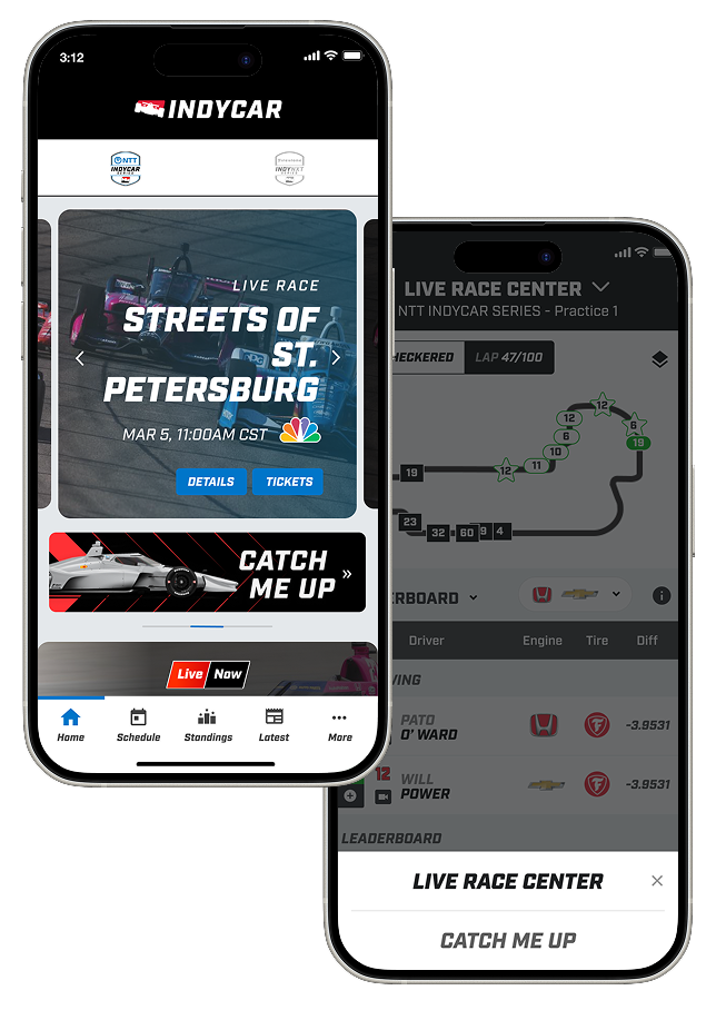
Entry Point: Existing Navigation
Up To Speed lives inside the Live Race Center via a dropdown, discoverable where fans already are during a race, without disrupting the current information architecture.
Chronological Layout Structure
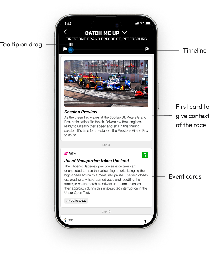
A structured, scrollable lap-by-lap layout lets fans follow the race progression naturally. The first card in the feed is always a Session Preview card with a photo pulled from the corresponding INDYCAR event. It gives the feed a visual anchor and sets context before the race action begins.
Interactive Timeline Scrubber
A race-length progress bar the user can drag to jump to any moment, or let track automatically as they scroll. A lap tooltip appears on drag and disappears at rest, keeping the UI clean without hiding context.
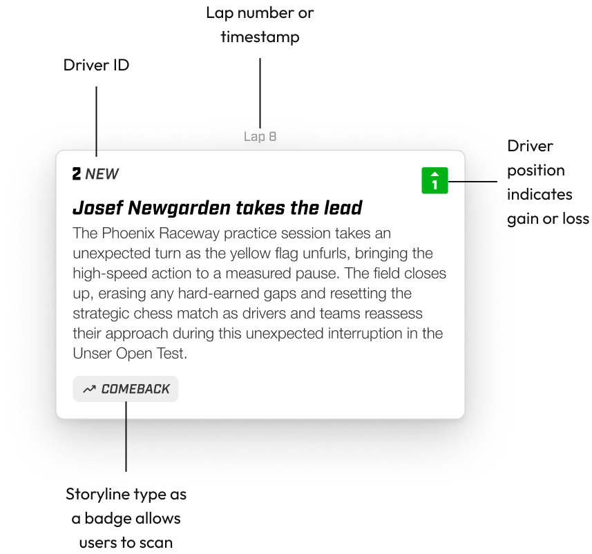
Anatomy of the Event Cards
Each card represents a significant moment in the race and is designed to be scannable. Every card follows a consistent structure, but the content changes depending on what data is available for that event type.
Lap Number — Each group of cards is anchored by a lap number header. If multiple events happen within the same lap, the number only appears once at the top of that group rather than repeating on every card. It keeps the feed from feeling cluttered while still giving fans clear race context.
Driver ID — When applicable, cards lead with a car number and short name tag. For moments involving multiple drivers, identifiers stack vertically so fans immediately understand it's a group event without reading a full sentence.
Position Indicator — A green or red directional icon in the top right of the card tells fans at a glance whether a driver gained or lost positions. These are pulled directly from existing INDYCAR components so they're consistent with what fans already see in the live race view.
Headline and Description — The headline is bold and delivers the moment. The description adds context for fans who want it, without becoming a transcript. We were deliberate about prompt engineering here: the AI output needed to feel like a recap, not a broadcast. This required iteration with INDYCAR SMEs.
Storyline Badge — Each card carries a badge that categorizes the event type, paired with an icon. These serve two purposes. For casual fans, they add a storytelling layer that makes the feed feel structured rather than a wall of text. For power users, they're a way to scan quickly for moments they care about. They're also tied directly to the storyline_type field from the backend, which means Phase 2 filtering is a data-layer addition rather than a redesign.
CROSS-FUNCTIONAL COLLABORATION
Working across data, AI, and product
This project required close collaboration across disciplines. A lot of my time was spent translating between what engineering could support and what fans actually needed to experience.
With Engineering
Event Blueprint Doc
Produced a detailed Excel mapping every event type to its card configuration: which elements show, hide, or change per storyline. This gave the engineering team a clear spec before any code was written and reduced back-and-forth during build.
With INDYCAR SMEs
Storyline Matrix Feedback
Facilitated a multi-team feedback session using a structured Miro board I prepared ahead of time, organizing subject matter expert comments from a live race test into 50+ actionable items sorted by prompt fix vs. engineering change.
With Stakeholders
Client Presentation
Created two presentation decks, one internal design walkthrough and one client-facing. Both were built to clearly explain design decisions, MVP scope, and a roadmap showing features designed to scale beyond Phase 1.
REFLECTION
What I'd do differently
Earlier in the project, I'd push for a fan research study to validate whether the lap-based chronological layout was the right organizing principle. We made that call based on stakeholder input and competitive intuition, but direct fan testing would have sharpened the information hierarchy faster.
I'd also build a more structured AI content quality review into the workflow from day one. A lot of the INDYCAR SME feedback centered on data integrity and prompt behavior, and a lightweight feedback loop baked into the pilot would have reduced the scope of those post-race review sessions considerably.
WHAT’S NEXT — PHASE 2
Designed to grow
The MVP was always a foundation. From the start, the design system was built to support three major Phase 2 features, each already prototyped and handed off.
FEATURE 1
Filtering & Sorting
Fans can filter the timeline by driver, team, storyline type (Comeback, Rivalry, Strategy), or severity. The badge taxonomy from MVP makes this a data-layer addition rather than a redesign.
FEATURE 2
Rich Media Integration
Video clips attached to event cards showing the exact moment a pass happened or a caution flew. Designed to increase emotional engagement and make position changes more tangible.
FEATURE 3
Website Experience
An overlay-first web experience that reuses the mobile component foundation for a faster rollout, with a future path to Picture-in-Picture video while browsing live race data.