Smart Sip
RESEARCH - INTERACTIVE PROTOTYPING
INTRODUCTION
Through this five month process, I learned the methods and skills involved in designing and prototyping interactive systems. I covered the design process from the initial formulation of the problem to iterations and the creation of digital prototypes. Our group created a number of artifacts that represent different stages of the design process like sketches, personas, low-fi and hi-fi prototypes, etc.

💧 The Problem
SmartSip was created to address the issue of insufficient water consumption. We believe that the lack of water consumption is due to people not being able to see their consumption and not being properly incentivized to drink enough water.
🥤 Our Solution
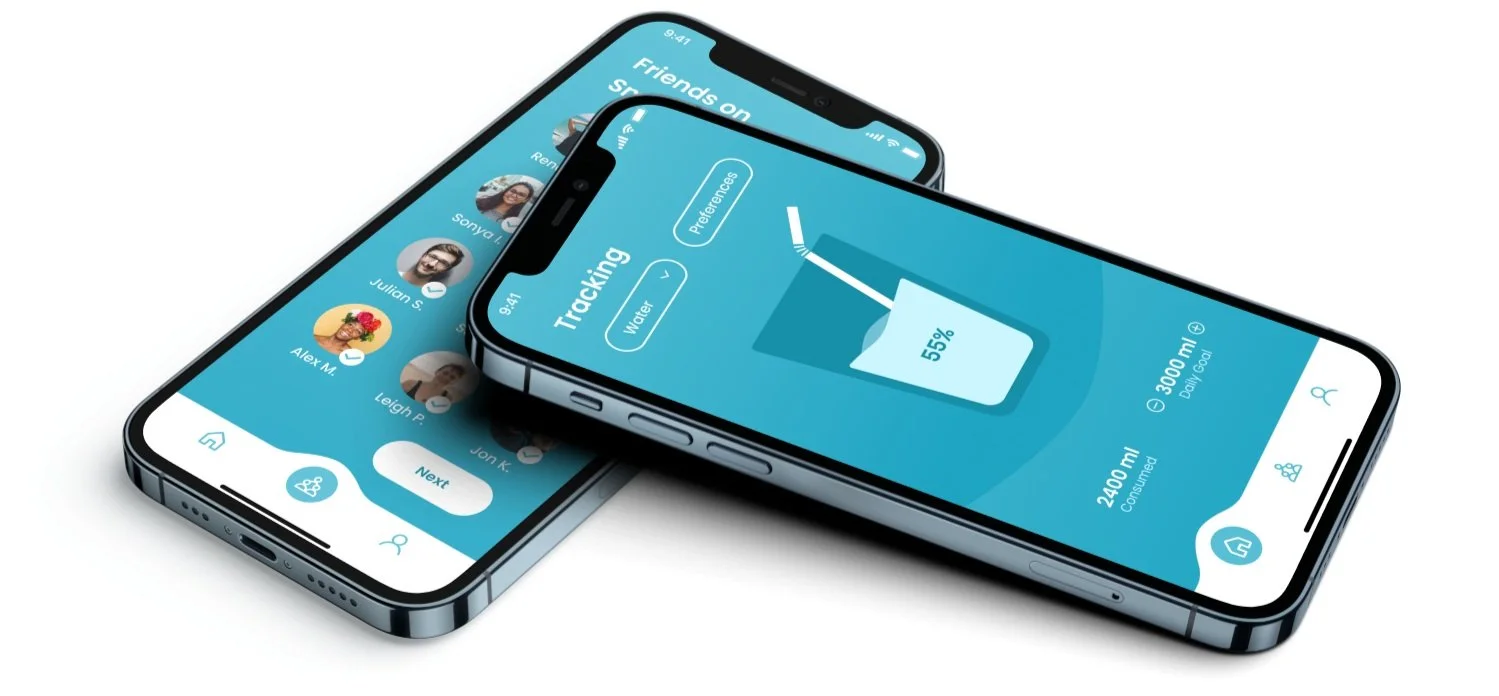
SmartSip is a straw with liquid tracking capabilities via our app. The app allows users to have their liquid consumption tracked real time. The app has a community aspect to it where individuals can join ‘Challenges’ to accomplish with their friends.
Our Users
Storyboarding

User Flow Chart
Our flow chart allowed us to visualize all the pathways a user could possibly take using our app. In this case, it let us notice any dead ends or challenges a user may have navigating to their desired screen.
USABILITY TESTING
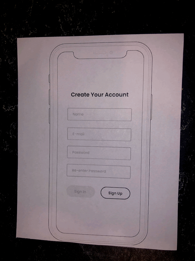
Version 1 Paper Prototype to Digital
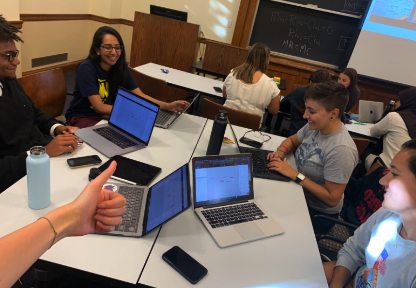
Our team printed out low fidelity screens in order to conduct user testing with our paper prototype. This user-centered design method allowed us a low-cost and time efficient way to ensure our product is meeting user needs. Because of its simplicity, it also allowed for non-designer and non-technical users to interact with it.
📑 Usability Defect Logs
In order to record usability issues with our initial paper prototypes, we used the following Usability Defect Log. This was a quick and efficient way to record the location, which interface feature, type, and severity of each usability issue that users had.
🕵🏻♀️ Usability Inspection and Iteration
The three usability tests gave us a lot of insightful feedback on our product. The four main issues and how we addressed them are as follows:
1. On the homepage, it is not clear what the Straw section indicates or where the Challenges section takes you.
Changes: Remove the straw battery info and the Challenges section from the homepage. Users’ challenges will be shown on the Challenges page and the straw battery info will be shown in My Straw page under Account.
3. On the Challenges page, users did not understand what the number next to My Progress meant.
Changes: Rather than having only a number next to the users’ progress section, we changed the layout to show Daily Ranking among participating friends including the user.
2. When asked to add all their friends, all users started individually selecting friends available on the page. The button on the top right allowing users to select all friends at once was not obvious.
Changes: A caption underneath the Select All icon indicates that the button allows you add all friends at once.
4. Users wanted to be able to easily see all the challenges they are currently involved in.
Changes: Add section on the Challenge page showing all the challenges a user is currently involved in.